From Figma to Code
In an effort to keep up with this site's ethos and show a bit more of how I design things, I thought I could share a Figma file and show the code used to produce what is contained in a Figma prototype.
TLDR:
Click here to go to the CodePen
What tools would I need?
Everything you need should be easily available 😀:
Optional
- Pen & paper for ~~doodling~~ quick ideating
What are we going to build?
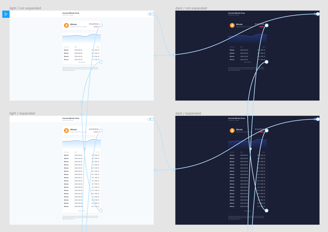
Let's build a few simple cards to track the prices of Bitcoin. ~~That way, we can see how much money we lost when we bought in during the hype.~~
We can also use Coindesk's open API when moving to code 👍.
Let's start with a use case:
A user wants to be able to see the current price of Bitcoin and a few recent price trends.
For fun, we'll throw in a way to toggle between light and dark mode - for the night traders 🦉.
Let's also start by reverse engineering what I did:
Design Tokens
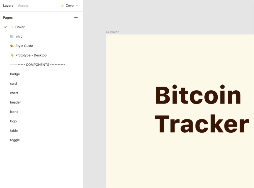
Let's get started by jumping into Figma. I think the most helpful takeaway from all of this, mostly for my own laziness, is to stay organized:
- 👩🏫 Name your frames/groups/components ...or else you're stuck with a bunch of things called Frame 107 or Group 69
- 🗂 Organize your pages - split components out of a prototype page and keep a separate page for research/documentation
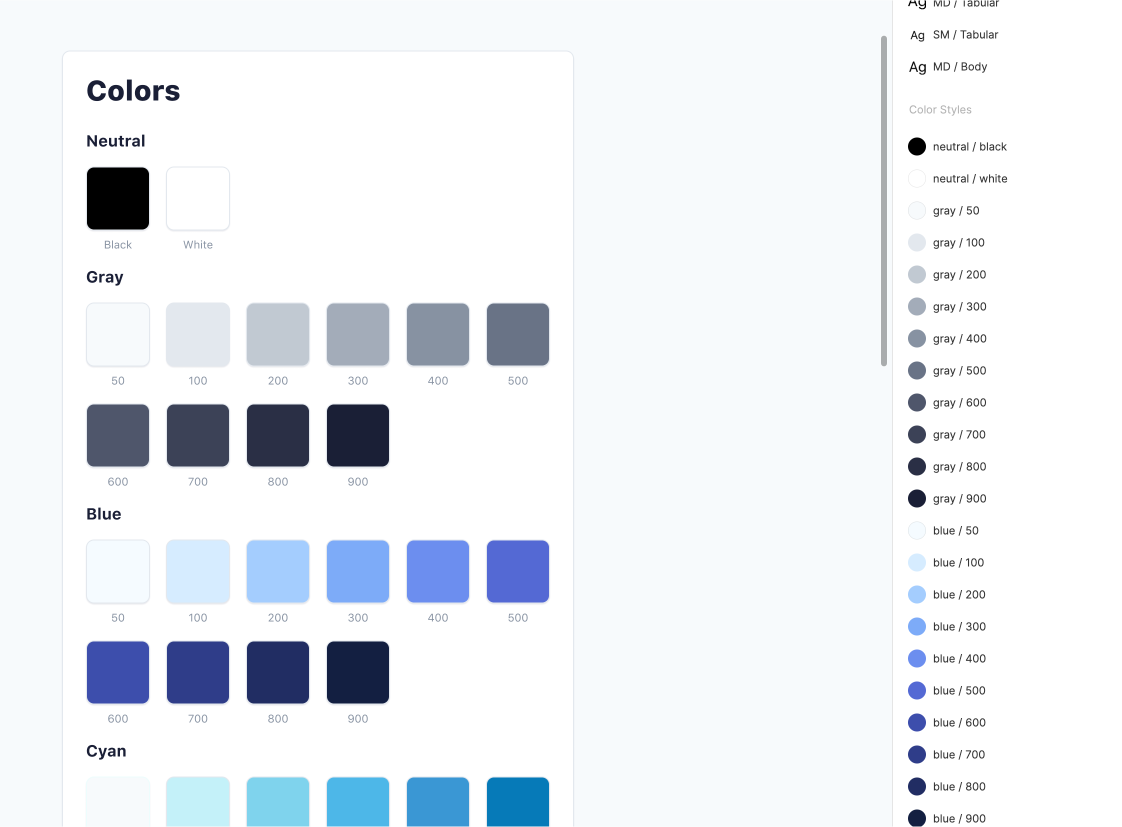
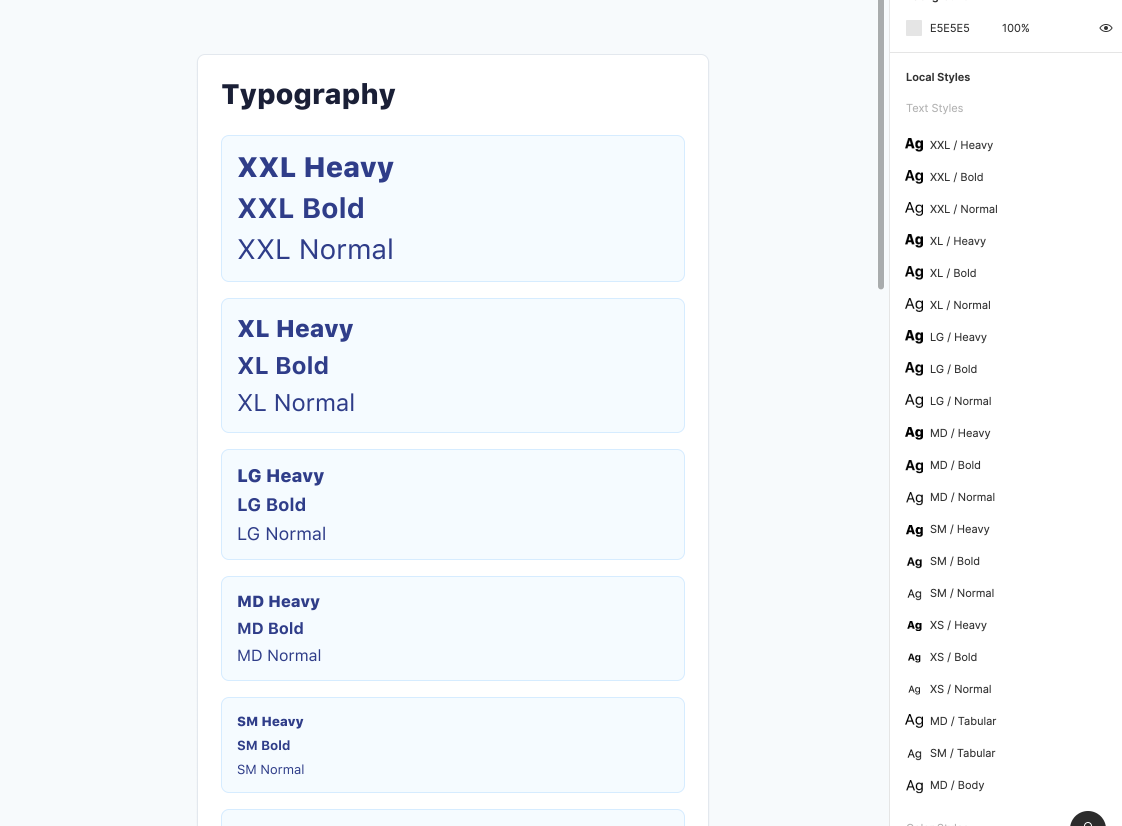
Now that we've finished a bit of housekeeping, we can start building some of the base UI. Using Figma's method for creating text and color styles, I created a color palette (with shades and tints) and text styles (with multiple weights):
Components
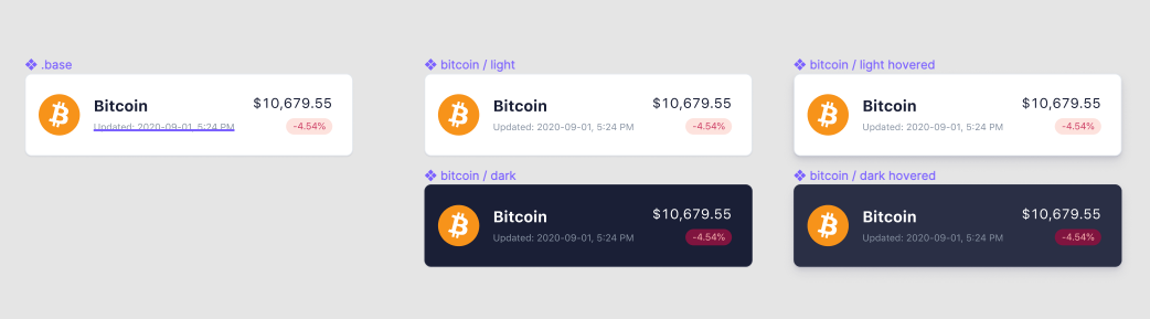
Now that we have a few colors and text styles to use, we can start building components. Since we're incorporating a dark and light mode, we probably need two versions of a component to accomodate for each theme. We would start by building a .base component - prefixed with a period to avoid publishing when we publish a library.
Now that we have a .base, we would use that to build light/dark versions of the components:
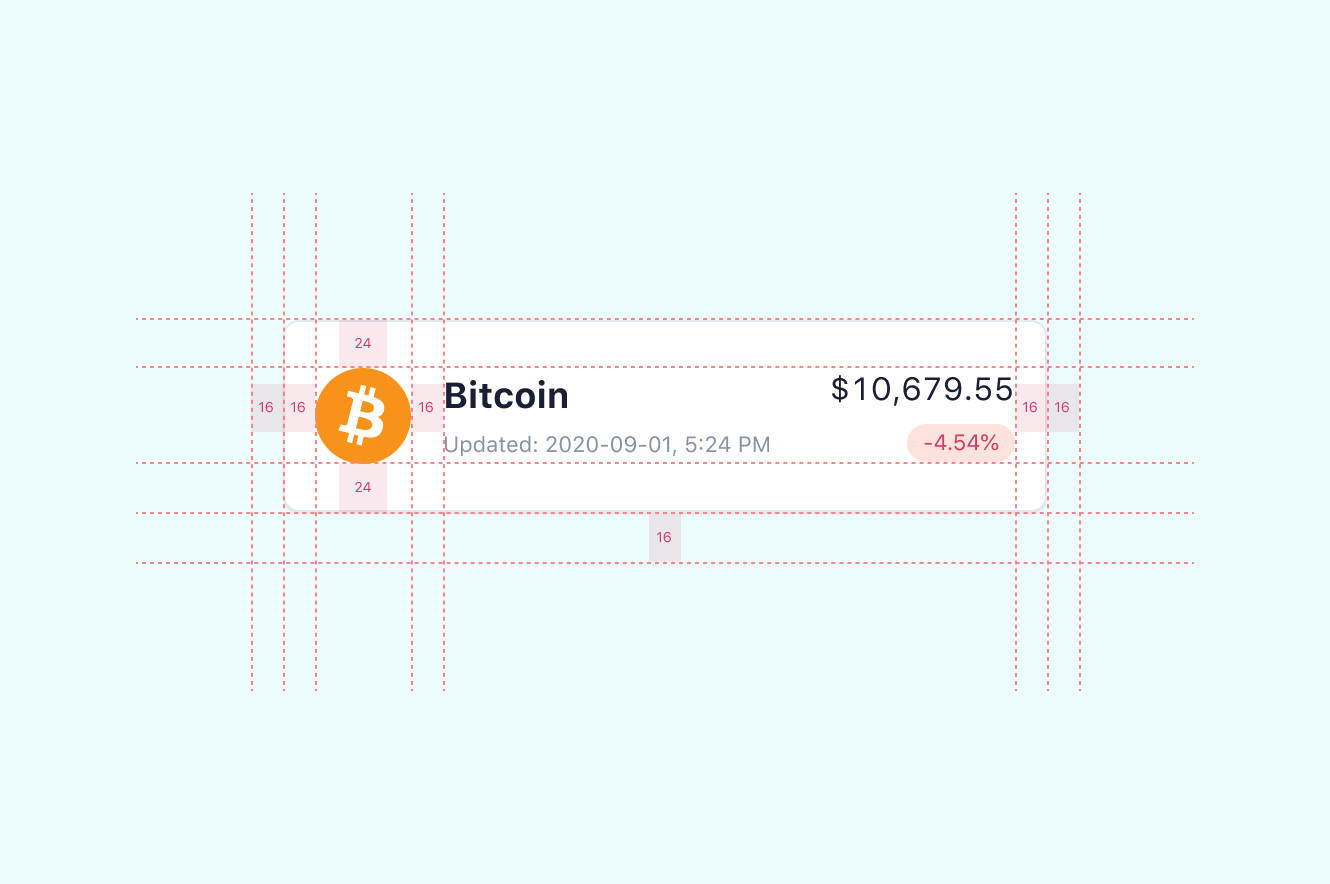
I'm designing using an 8pt grid and am using multiples/fractionals of 8 as spacing units. Let's take a look at a redline of a card component and see how we're using multiples of 8 as spacing values:
Once we finish building our components, we can start building the layout:
Since we have different versions of our components for light/dark mode, duplicating and switching out components should be easy:
Code
Now that we have a functioning prototype in Figma, we can start crafting a bit of code. If you'd like to skip to the end:
Click here to go to the CodePen
Inserting our Design Tokens
By using CSS custom properties (variables) we can add in our color design tokens to help build out the light and dark theme of our UI.
// colors from design tokens--sail-color-black: #000;--sail-color-white: #fff;--sail-color-gray-50: #f7fafc;--sail-color-gray-100: #e3e8ee;--sail-color-gray-200: #c1c9d2;--sail-color-gray-300: #a3acb9;--sail-color-gray-400: #8792a2;--sail-color-gray-500: #697386;--sail-color-gray-600: #4f566b;--sail-color-gray-700: #3c4257;--sail-color-gray-800: #2a2f45;--sail-color-gray-900: #1a1f36;--sail-color-blue-50: #f5fbff;--sail-color-blue-100: #d6ecff;--sail-color-blue-200: #a4cdfe;--sail-color-blue-300: #7dabf8;--sail-color-blue-400: #6c8eef;--sail-color-blue-500: #5469d4;--sail-color-blue-600: #3d4eac;--sail-color-blue-700: #2f3d89;--sail-color-blue-800: #212d63;--sail-color-blue-900: #131f41;--sail-color-cyan-50: #edfdfd;--sail-color-cyan-100: #c4f1f9;--sail-color-cyan-200: #7fd3ed;--sail-color-cyan-300: #4db7e8;--sail-color-cyan-400: #3a97d4;--sail-color-cyan-500: #067ab8;--sail-color-cyan-600: #075996;--sail-color-cyan-700: #06457a;--sail-color-cyan-800: #093353;--sail-color-cyan-900: #042235;--sail-color-green-50: #efffed;--sail-color-green-100: #cbf4c9;--sail-color-green-200: #85d996;--sail-color-green-300: #33c27f;--sail-color-green-400: #1ea672;--sail-color-green-500: #09825d;--sail-color-green-600: #0e6245;--sail-color-green-700: #0d4b3b;--sail-color-green-800: #0b3733;--sail-color-green-900: #082429;--sail-color-yellow-50: #fcf9e9;--sail-color-yellow-100: #f8e5b9;--sail-color-yellow-200: #efc078;--sail-color-yellow-300: #e5993e;--sail-color-yellow-400: #d97917;--sail-color-yellow-500: #bb5504;--sail-color-yellow-600: #983705;--sail-color-yellow-700: #762b0b;--sail-color-yellow-800: #571f0d;--sail-color-yellow-900: #3a1607;--sail-color-orange-50: #fffaee;--sail-color-orange-100: #fee3c0;--sail-color-orange-200: #f8b886;--sail-color-orange-300: #f5925e;--sail-color-orange-400: #e56f4a;--sail-color-orange-500: #c44c34;--sail-color-orange-600: #9e2f28;--sail-color-orange-700: #7e1e23;--sail-color-orange-800: #5d161b;--sail-color-orange-900: #420e11;--sail-color-red-50: #fff8f5;--sail-color-red-100: #fde2dd;--sail-color-red-200: #fbb5b2;--sail-color-red-300: #fa8389;--sail-color-red-400: #ed5f74;--sail-color-red-500: #cd3d64;--sail-color-red-600: #a41c4e;--sail-color-red-700: #80143f;--sail-color-red-800: #5e1039;--sail-color-red-900: #420828;--sail-color-purple-50: #fff8fe;--sail-color-purple-100: #fce0f6;--sail-color-purple-200: #f0b4e4;--sail-color-purple-300: #e28ddc;--sail-color-purple-400: #c96ed0;--sail-color-purple-500: #a450b5;--sail-color-purple-600: #7b3997;--sail-color-purple-700: #5b2b80;--sail-color-purple-800: #401d6a;--sail-color-purple-900: #2d0f55;--sail-color-violet-50: #f8f9fe;--sail-color-violet-100: #e6e6fc;--sail-color-violet-200: #c7c2ea;--sail-color-violet-300: #b0a1e1;--sail-color-violet-400: #9c82db;--sail-color-violet-500: #8260c3;--sail-color-violet-600: #61469b;--sail-color-violet-700: #4b3480;--sail-color-violet-800: #352465;--sail-color-violet-900: #1f184e;
// light mode--bg: var(--sail-color-gray-50);--color: var(--sail-color-gray-900);--subtleColor: var(--sail-color-gray-400);--successBg: var(--sail-color-green-100);--successColor: var(--sail-color-green-500);--dangerBg: var(--sail-color-red-100);--dangerColor: var(--sail-color-red-500);--cardBg: var(--sail-color-white);--cardShadow: var(--sail-color-gray-100);--cardBgHover: var(--sail-color-white);--primary: var(--sail-color-blue-500);--primarySubtle: var(--sail-color-blue-100);--transparent: rgba(255,255,255,0);--transparentSubtle: rgba(255,255,255,.6);
// dark mode - we can overwrite the utility variables by wrapping it in a class on the :root--bg: var(--sail-color-gray-900);--color: var(--sail-color-gray-100);--successBg: var(--sail-color-green-700);--successColor: var(--sail-color-green-200);--dangerBg: var(--sail-color-red-700);--dangerColor: var(--sail-color-red-200);--cardBg: var(--sail-color-gray-900);--cardShadow: var(--sail-color-gray-800);--cardBgHover: var(--sail-color-gray-800);--primarySubtle: var(--sail-color-blue-800);--transparent: rgba(26,31,54,0);--transparentSubtle: rgba(26,31,54,.6);
Now that we have our colors and themes, we need to add in our text styles and sizes that we defined in our text styles in Figma:
--text-xxl: 2.8rem;--text-xl: 2.4rem;--text-lg: 1.8rem;--text-md: 1.6rem;--text-sm: 1.3rem;--text-xs: 1.1rem;
--text-heavy: 900;--text-bold: 700;--text-normal: 400;
Switching Themes
Now for the theme switching part - we need a function to trigger when a toggle button is clicked. We can make a simple function to check if the root element on the page contains the dark mode class. Using a ternary operator, we can remove/add the class if that check returns as true/false:
// Our toggle with id of buttonconst themeButton = document.getElementById('themeButton')
// theme switcher functionconst changeTheme = () => {  let themeState = document.documentElement.classList.contains('theme--dark')  themeState ? themeButton.classList.remove('c-theme--active') : themeButton.classList.add('c-theme--active')  document.documentElement.classList.toggle('theme--dark')}
And now we can add it to our toggle button:
<button id="themeButton" onclick="changeTheme()"> <handle/> <icon/></button>... and boom goes the dynamite 🧨

Layout
Here's what the markup for my layout looks like so far:
<header class="l-header"> <div class="u-pb--16 u-pt--16 u-display--flex u-align-items--center u-justify--space-between l-header__body u-pr--16 u-pl--16"> <div class="u-text--left"> <div class="u-text--md u-text--bold u-mb--4">Title</div> <div class="u-text--xs u-text--subtle">Subtitle</div> </div> <button class="c-theme u-text--xs" id="themeButton" onclick="changeTheme()"> <handle/> <icon/> </button> </div></header><div class="l-wrapper u-pr--16 u-pl--16 u-pt--32" id="list"> <!-- This is where we can insert our Bitcoin card and table --></div>You might be wondering what all of those classes mean. Most of my styles are utility classes and are prefixed with a letter using BEM. Utility classes are reusable, single-purpose style classes that I can add to web elements. For example, if I wanted to style text in our MD size, I could create a class named .u-text--md and add it to the web element. Utility classes help me build things quickly, but feel free to craft these styles in a different way - and don't forget to have fun homie 😎.
I'm also organizing these styles with prefixes and BEM naming conventions:
- l = layout
- u = utility
- c = component
Learn more about utility classes
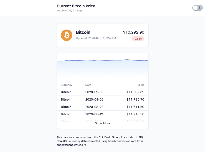
Getting the Bitcoin Data
We also need to call the data from Coindesk. Since the current price data and historical data are two different endpoints, we need to make multiple calls.
By using Axios, we're able to do this easily in javascript:
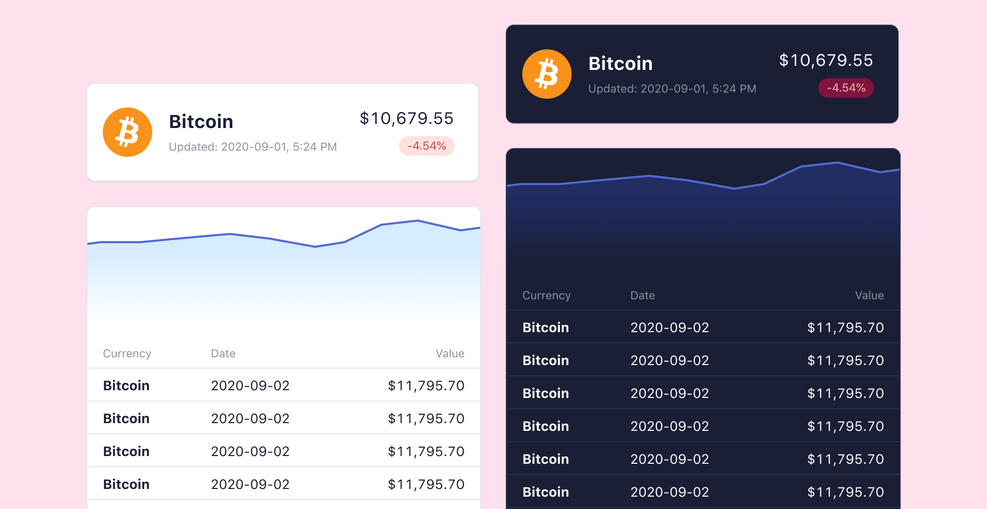
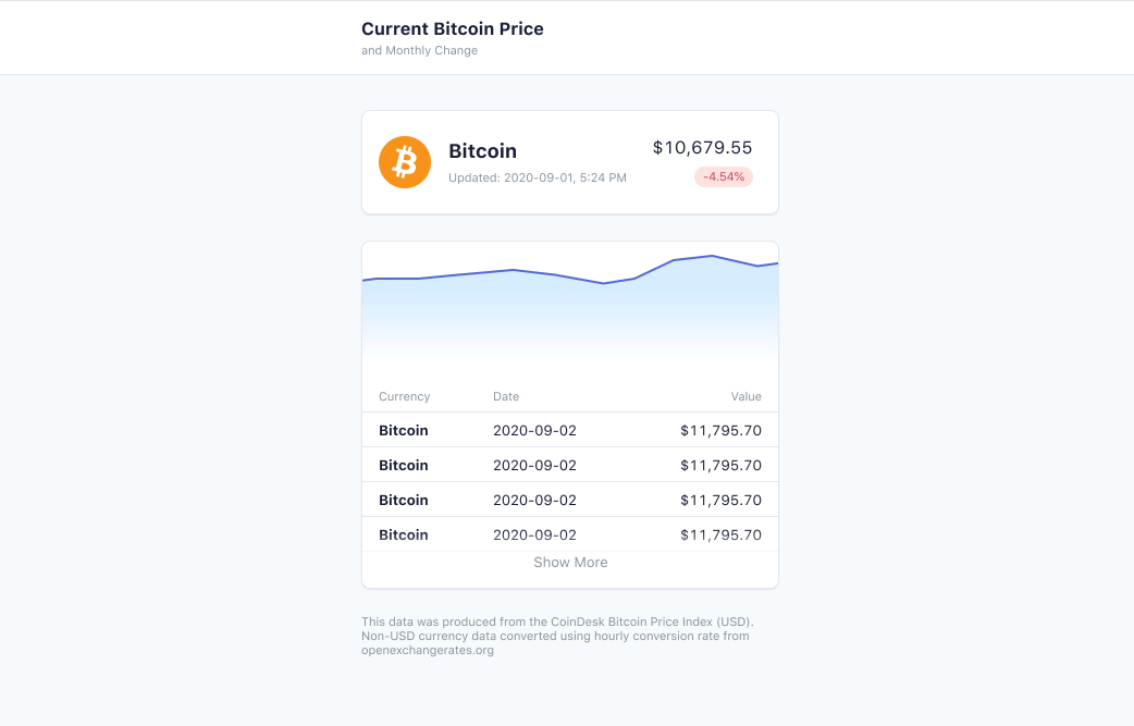
axios.all([ axios.get(current_url), axios.get(history_url)]).then(res => { // do stuff with the data // create and add HTML with data to the page})After a little bit of styling and data transformation, we should have something close to this:
Conclusion
I'd love to know if this helps you design things and if shedding a bit of light on my process helps. If you have any ideas that could make this small project better, send me a message!
 Read more notes