Portfolio Redesign
A few months back, I began redesigning my portfolio - again 🤦♀️. I not only wanted to add a couple of the newer projects I was working on, but I also wanted to address larger design issues and experiment with building it in some newer technologies.
Although the overall design might seem unchanged at a glance, I implemented/changed a ton of details in the design and under-the-hood.
Tools
If you're setting out to (re)build your portfolio, there are a few routes/tools you can choose from:
- Webflow: low-code / super popular
- Squarespace: WYSIWYG / easy-to-use / no-code
- Carrd: Simple / cheap / no-code
- Semplice: no-code / WYSIWYG
- Adobe Portfolio: free with Creative Suite / no code
- Code it yourself: HTML, CSS, JS / Jekyll / Gatsby / Next / etc.
I'm probably forgetting some, but I think that should cover what most designers use to build their portfolios.
I chose to code my previous portfolio. I also chose to code my new portfolio, but with newer technologies.
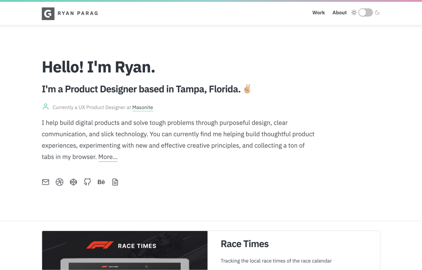
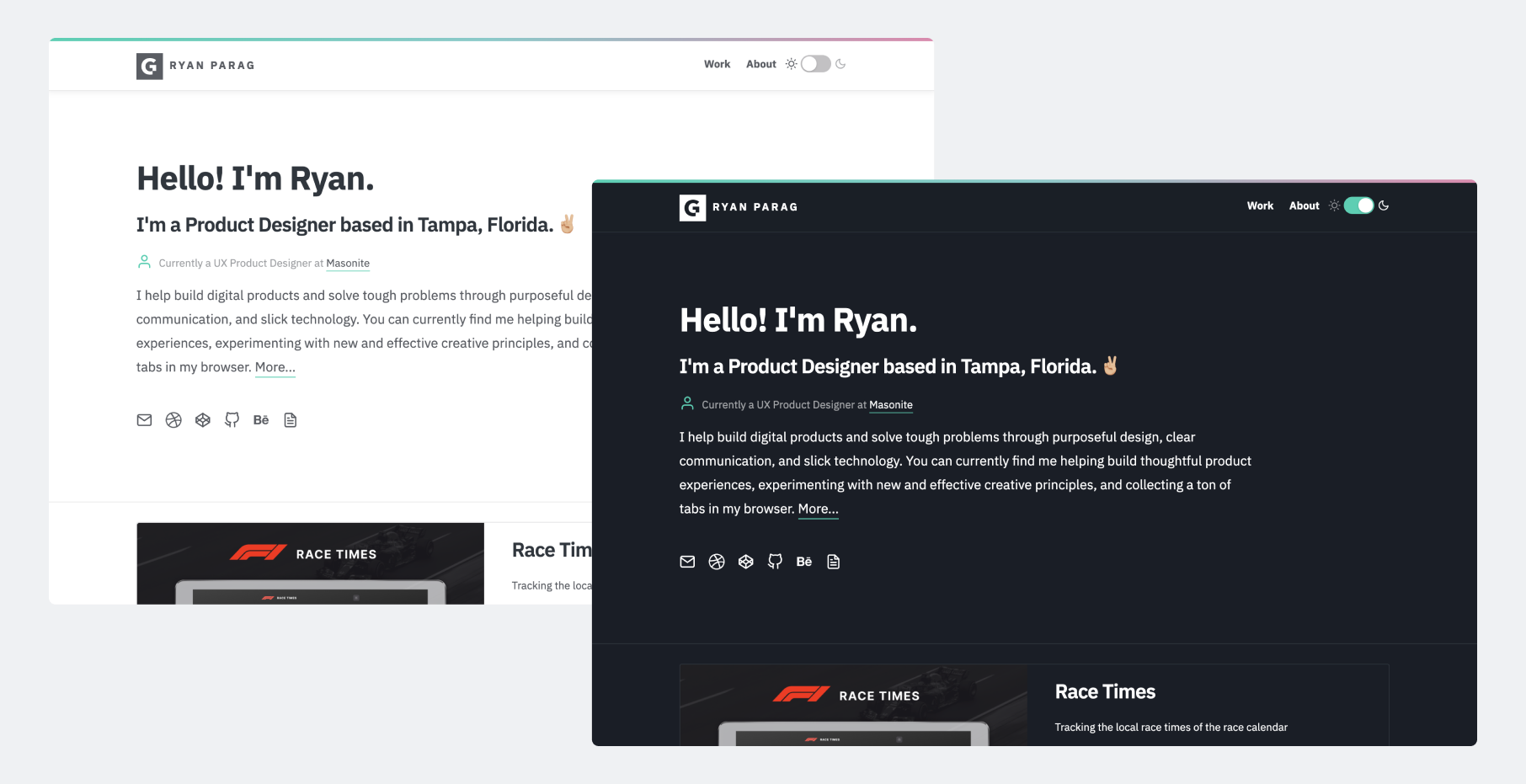
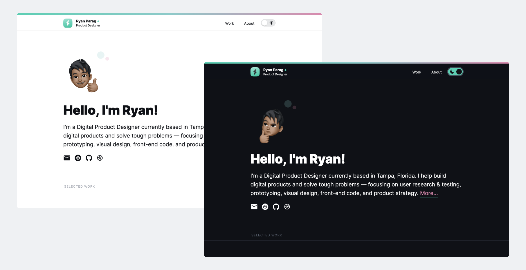
👆My old portfolio (~2016). Previously, I coded my portfolio using:
- Sketch for ideating/designing
- Pug
- SCSS
- JS, Jquery
- Drag-and-drop FTP for deploying
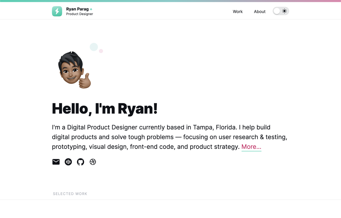
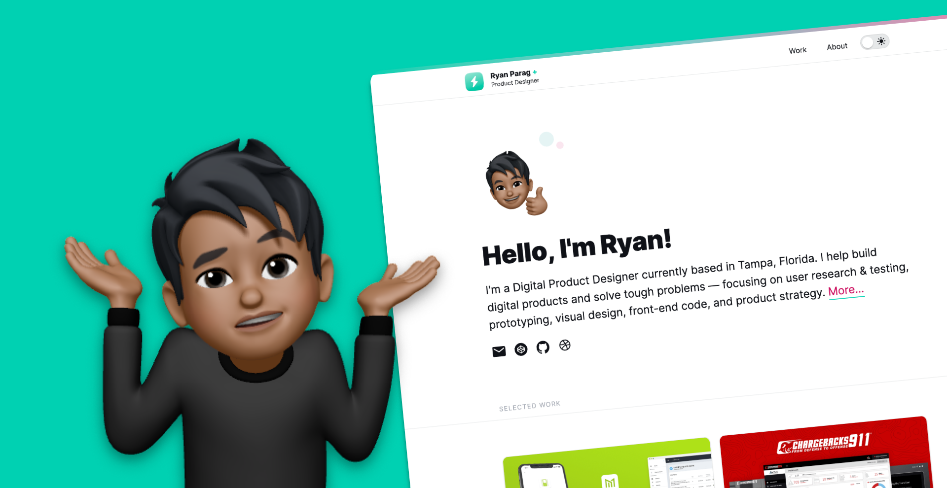
👆My new portfolio ✨. This time, I chose some more modern technologies:
- Figma for ideating/designing
- React and Gatsby
- Styled Components
- MDX for markdown-ish pages
- Vercel for deploying
Typography
Previously, I was using:
IBM Plex Sans: a tall x-height sans-serif that comes in a wide range of weights
I switched to:
Inter: an open-source sans-serif made for more-legible UI
Why did I choose to change the typographic style?
Because 🤷♀️- but really, I wanted to implement a bit more minimalism and not have the typography intrude on the designs I would be showcasing.
Colors and Dark Mode
I love when I see websites/apps give me the option to choose to use dark/night modes. When I was building out my previous portfolio, I really wanted to implement the feature and give viewers the option to choose which to use.
Old:
$grey-900: hsla(220, 24%, 7%, 1);$grey-800: hsla(220, 21%, 13%, 1);$grey-700: hsla(220, 18%, 21%, 1);$grey-600: hsla(220, 15%, 29%, 1);$grey-500: hsla(220, 12%, 37%, 1);$grey-400: hsla(220, 9%, 68%, 1);$grey-300: hsla(220, 6%, 76%, 1);$grey-200: hsla(220, 3%, 91%, 1);$grey-100: hsla(0, 0%, 96%, 1);
$color-green: #00d1b2;$color-blue: #79cbca;$color-pink: #e684ae;
New:
colors: { base: { grey900: 'hsla(220, 24%, 7%, 1)', grey800: 'hsla(220, 21%, 13%, 1)', grey700: 'hsla(220, 18%, 21%, 1)', grey600: 'hsla(220, 15%, 29%, 1)', grey500: 'hsla(220, 12%, 37%, 1)', grey400: 'hsla(220, 9%, 68%, 1)', grey300: 'hsla(220, 6%, 76%, 1)', grey200: 'hsla(220, 3%, 91%, 1)', grey100: 'hsla(0, 0%, 96%, 1)', grey0: 'hsla(0, 0%, 100%, 1)', }, states: { green: 'hsla(171, 100%, 41%, 1)', blue: 'hsla(179, 44%, 64%, 1)', pink: 'hsla(334, 66%, 71%, 1)', greenTransparent: 'hsla(171, 100%, 41%, .2)', blueTransparent: 'hsla(179, 44%, 64%, .2)', pinkTransparent: 'hsla(334, 66%, 71%, .2)', visited: 'hsla(334, 86%, 43%, 1)', greenDark: 'hsla(171, 100%, 35%, 1)', blueDark: 'hsla(179, 44%, 40%, 1)', } }Things I changed in the color theme:
- Higher-contrast
- Transparency and variants
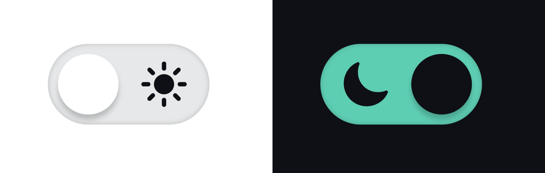
I also chose to change the UI for the toggle itself.
Could I make the theme toggle a simpler design?
Old:
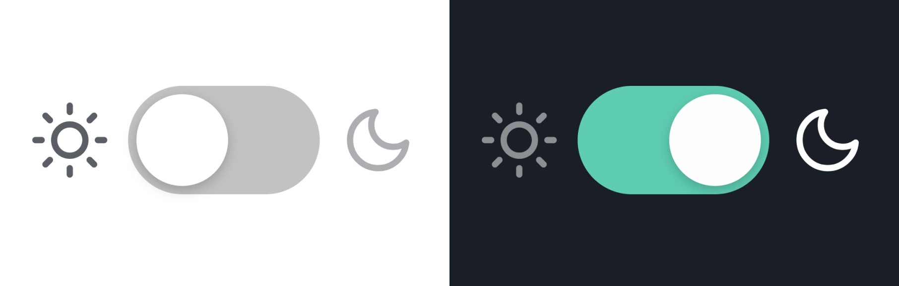
New:
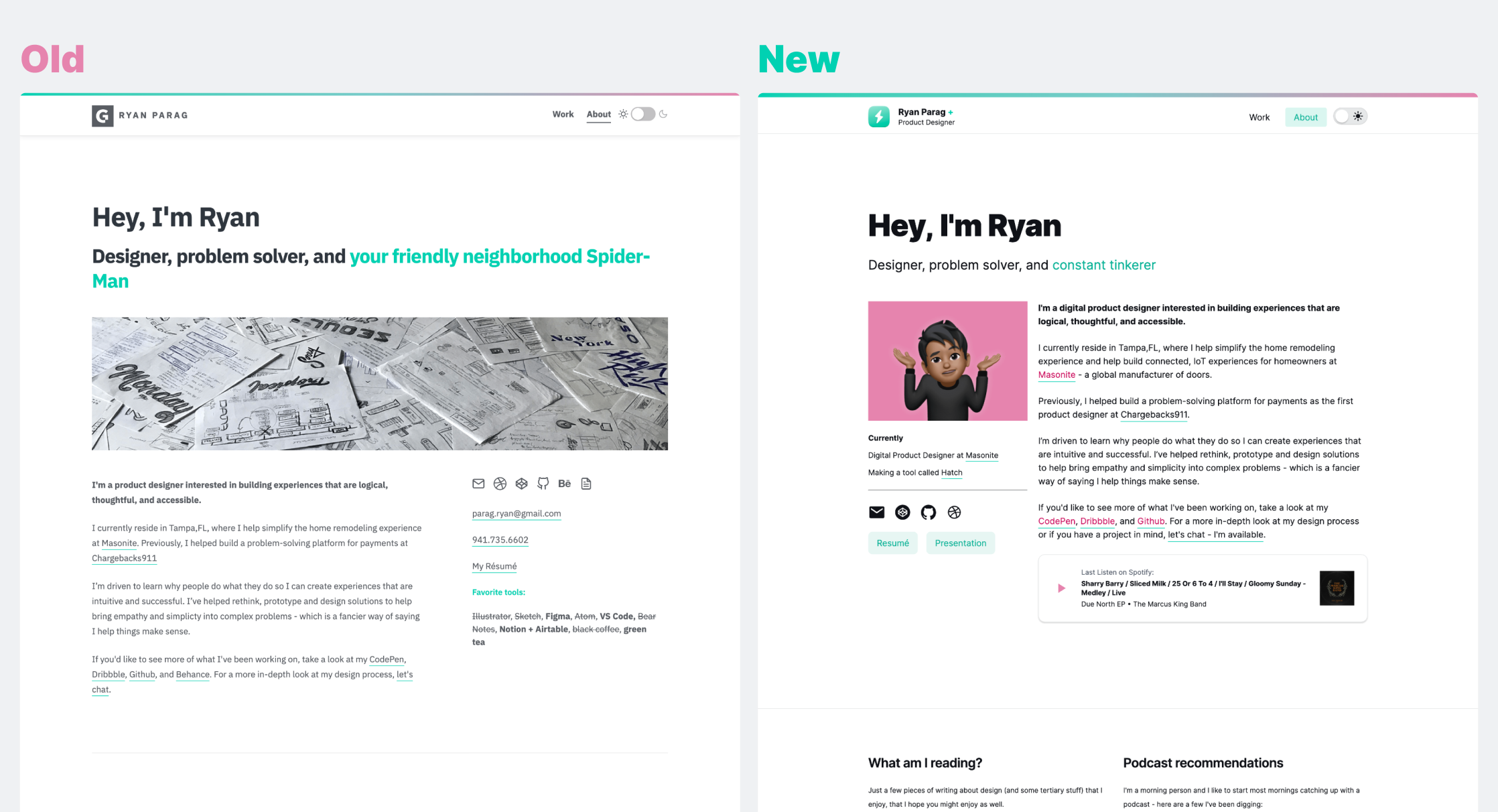
About Page
I wanted to make the about page focus on the content more. Here are the things that changed:
- Condensed the grid
- Focus on the content by building hierarchies
- Add in Spotify items through Spotify's API
- Add things I'm currently enjoying
- Reduced number of social media/contact items
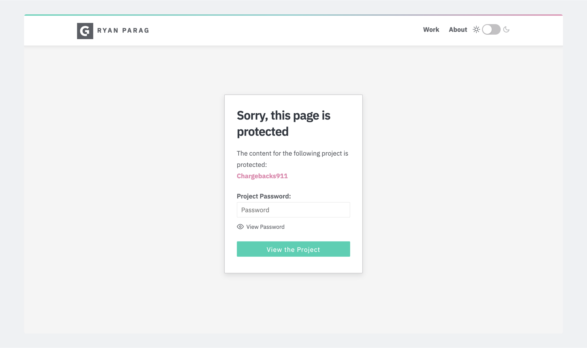
Auth and Private Projects
Alot of tools (Webflow, Squarespace) let designers password-protect projects using their CMS platform. Even previously, I needed to figure out a way to simply password protect selected projects.
Using a little JavaScript, I could hide routes and show users a password-protect screen on projects that required authorization. I also chose to add in some custom lettering for a bit of flourish when users came upon this page:
Old:
New:
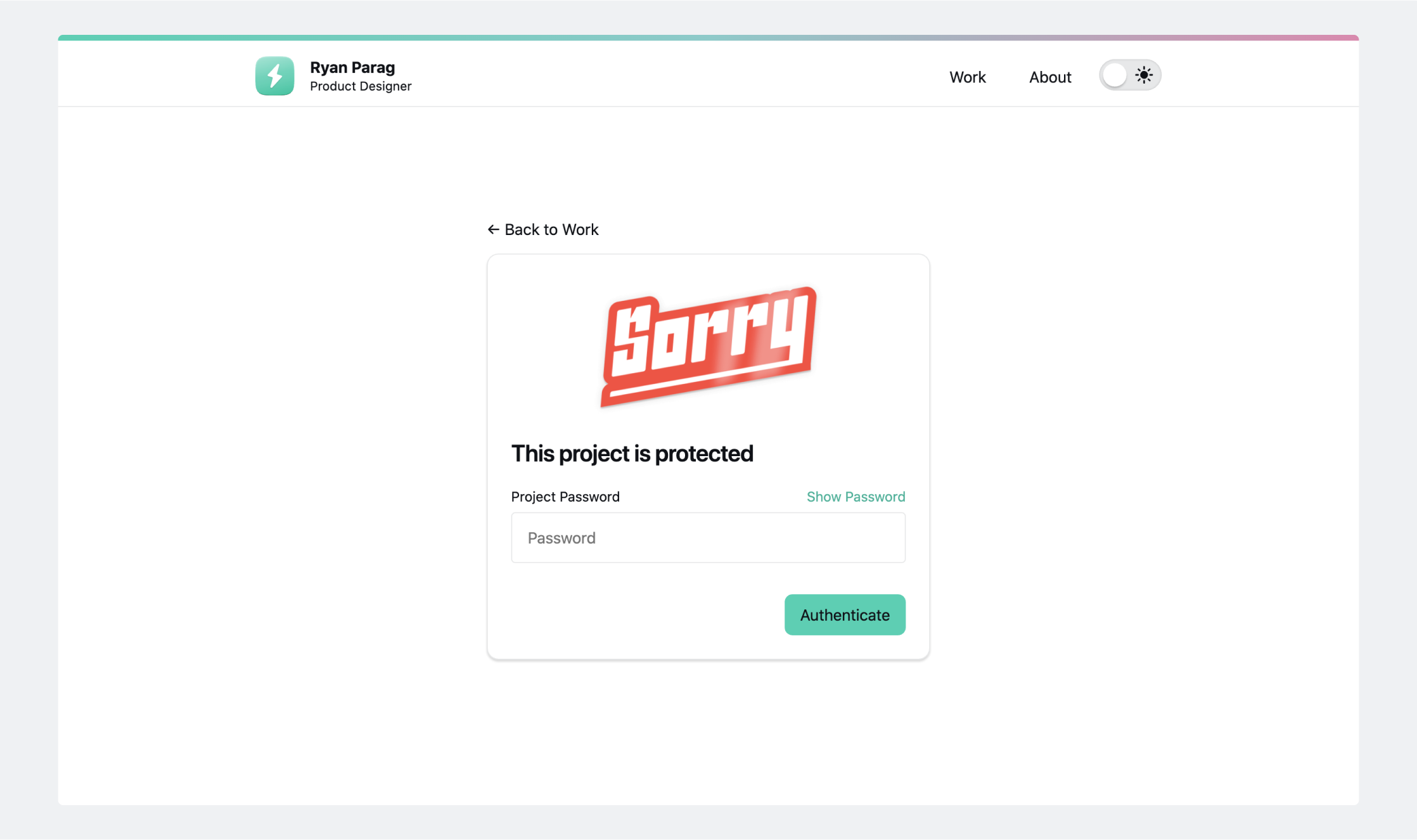
One of the most annoying things when looking at portfolios with password-protection is the fact that users must repeatedly input a password when entering password-protected projects.
What if I could make it so users only have to input the password once and saved a logged-in state?
In my new portfolio I have it so once users enter the password once, they no longer have to input a password again. A few other navigation items become available, as well as a nice little "+" next to the logo.
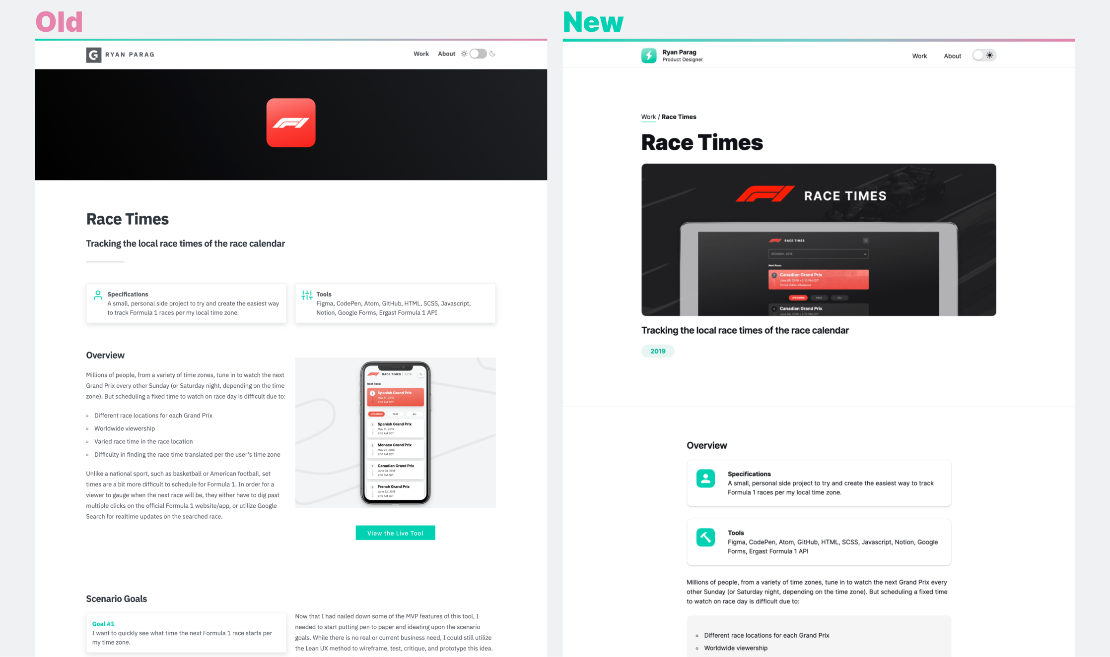
Pages
Layout was all over the place in my old portfolio. I wanted to change it so the layout was more Medium-like (single column) and was a less sporadic while scrolling through. On top of changing the page headers, I changed it so that each case study had defined sections:
Conclusion
Hopefully some of that helps! I'm still making incremental changes, but if you have feedback or need help with your own portfolio, ping me using the form below.